|
Audio Blog 5 Mins This is Paulette Smith with your DonPaul Marketing Moments. This is a continuing conversation about your Banding Kit and how each tool in your kit can help you build onto your most valuable business asset…your database. For those who are just catching up we’ve looked into some of the tools in a Branding Kit such as your logo, Taglines, Slogans, and Jingles and Colors for your brand and if you are an audio subscriber, we appreciate you. You’ll find active links to all these topics in my online version of this blog @ donpaul.com tap on MM_Blog. Today, a few thoughts about typography…you know…typography, that’s very simply the style and appearance of the printed matter in your branding kit. I say “very simply” when actually, the style and appearance of your print and typeface can play a critical role in the way your target audience relates and reacts to your brand. Remember when we touched on colors and how colors can evoke certain emotions within your audience? Well, typography, depending on the arrangement of letters and text can elicit certain emotions as well, and convey subtle messages to the people you are trying to reach. As with all skilled and professionals, a typographer could probably dazzle you with wonderful ways to set up your messages and such, and if your budget allows, then sure you should consider hiring someone, however, you can set yourself apart from your competitors by keeping your goals and your audience in focus.
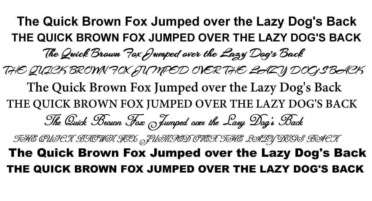
Here are just three things to think about as you set up the text and letting style for your brand: 1. Consistency: Some folks who are new to business, may think that using different styles of text and lettering can be fun and interesting, when in truth it can be distracting and appear unprofessional. And so, as with many other tools in branding your business … consistency is key. Yes I know …you are creative soul, and you like to switch things up a bit…but the recommendation is to be cohesive with your website, logo, ads, and everything that touches your brand…it will save you time, energy, money and give your audience an opportunity to build trust. 2. Readability: So … you sell flowers and you’ve found a wonderful flowery script font that speaks to you and you are certain will speak to your audience as well. May I suggest that you go a little easy with the fancy fonts? Why? Because what you can see may not be as readable on all platforms and devices, additionally, one problem I often encounter is when my client wants a certain term in capital letters but the font they selected does not translate. We all know to use capitalization sparingly, but I suggest you use the old-school method of typing out every letter of your chosen font in lower case as well as upper case. Use a phrase like “The quick brown fox jumped over the lazy dog’s back”. Often you may find the need for a more toned down version of a font to accompany your script version. 3. Visual Identity: Yes it’s important to set your business apart and to do that with certainty you can even have a unique set of fonts created just for your unique purposes. Once again I ask you to think long term and while consistency is extremely important, there may come a time when you will need to change designers or the vendor who originally equipped you with your glorious typeface. Therefore, be sure to keep all records whether you are using free fonts or a purchased font…save a back up of the set or sets in the cloud along with all of the specifics that can be used in the future if need be. I’ve got lots and lots of tips about the oh-so-seemingly-simple world of typography and I’d love to share some more information with you, I hope you’ll consider having a chat with me, visit DonPaul.com and click on contact. Let’s get exactly what you need in your branding kit to help you grow your most valuable business asset…that’s right your data base! Until next time bye bye!
0 Comments
|
Welcome to
DonPaul Marketing Moments With Paulette Smith
Subscribe to
Marketing Moments Topics
All
|


 RSS Feed